
The low life expectancy of Americans is not just about deaths among young people
Even those who reach 65 are at a disadvantage relative to peer countries.

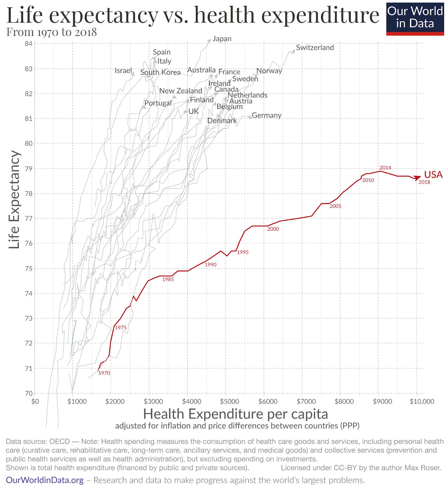
One of our most popular charts at Our World in Data over the years has been this one.1 On the x-axis, we have health expenditure per person, and on the y-axis, life expectancy at birth. Each line is a single country, and it runs from 1970 to 2018 [our interactive version has data up to 2023].
The United States is the clear standout. It spends a lot more on healthcare than its peers, yet appears to receive little in return in terms of life expectancy. Americans have a lower life expectancy than other rich countries, despite paying far more.
Recently, I saw the economist Tyler Cowen spark a discussion on whether the US looks bad on life expectancy at birth because of far higher death rates at young ages. It has higher rates of young people dying from homicides, suicides, drug overdoses, and car crashes, and this really pulls down its “at birth” numbers.
The argument follows that once Americans reach older ages, their life expectancy is very good and comparable to that of other wealthy countries.
I’ve seen others make similar claims, so I wanted to figure out if it was true.
To do this, I used the latest estimates of life expectancy from the Organisation for Economic Co-operation and Development (OECD).2 This means we’re mostly comparing the US to other high-income countries.
The key takeaway is that young deaths are an important part of the US’s disadvantage, but not all of it. Americans who live to 65 still have lower life expectancy than those elsewhere. The differences narrow by age 80, but this is at least partly due to the selection bias of who survives.3
The US ranks extremely low on life expectancy at birth
Let’s start with a well-established point: the United States has a particularly low life expectancy at birth, both in terms of its level of income and its level of health spending.
Life expectancy at birth does not tell us what the most common or “modal” age of death is. It tells us the average lifespan a newborn would be expected to live if mortality rates at each age stayed the same throughout its lifetime. If the average life expectancy is 75 years, this does not mean a 50-year-old should expect the most probable outcome is that they die in 25 years.
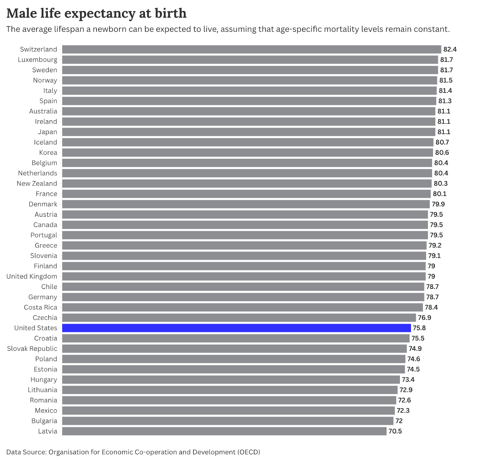
In the chart below, you can see male life expectancy at birth in 2023 across a range of OECD countries, with the US in blue. It’s around 76 years. That’s less than both the mean of 78.2 years and the median of 79.4 years in the dataset. It’s about 6 years lower than the leaders.
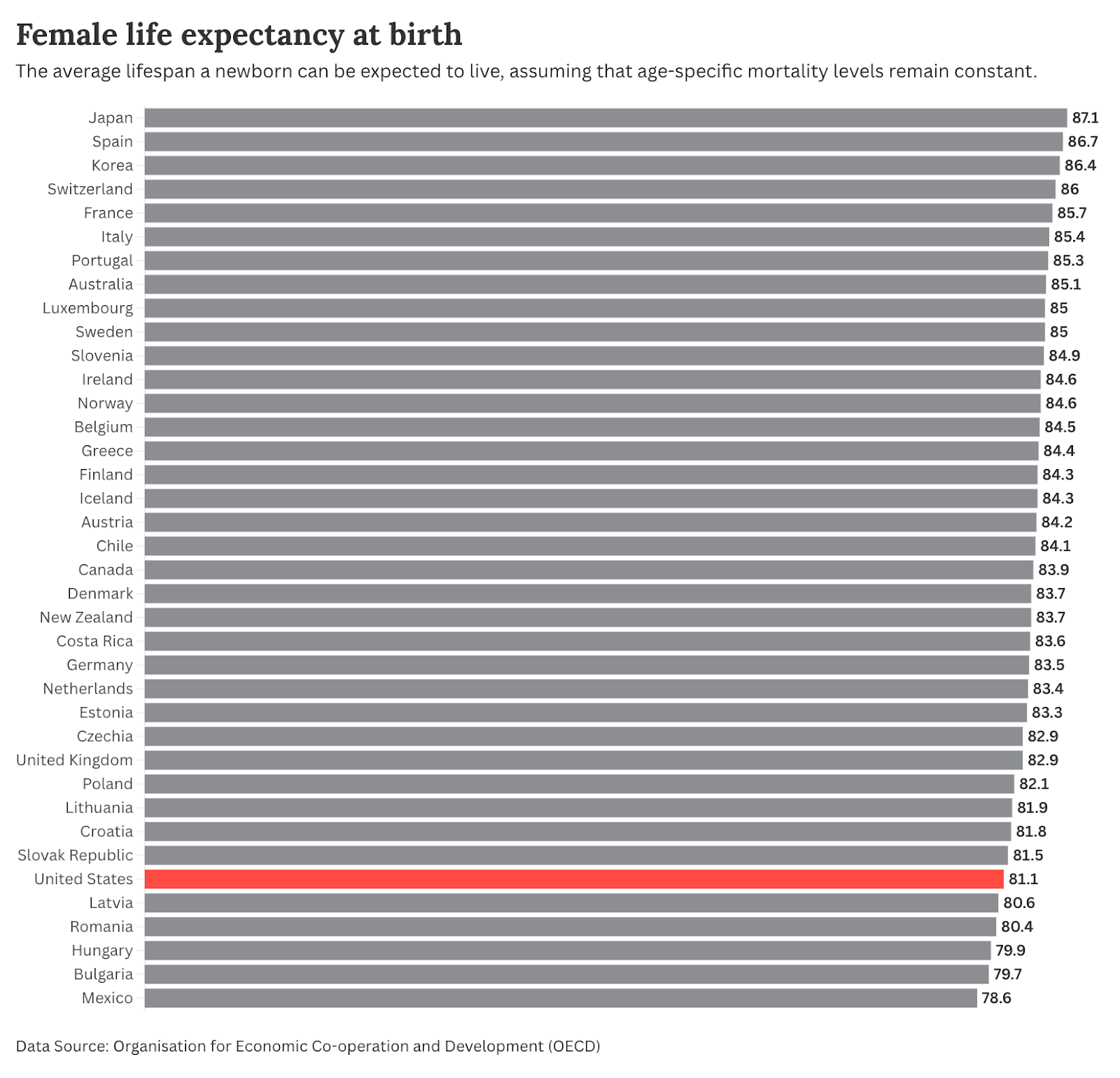
Women in the US rank even lower relative to their peers (although they still live longer than American men). At 81 years, the US is close to the bottom of the list. Again, they’re around 6 years behind the leaders, and below the mean and median, which are both 84.
America does have particularly high rates of death among younger adults
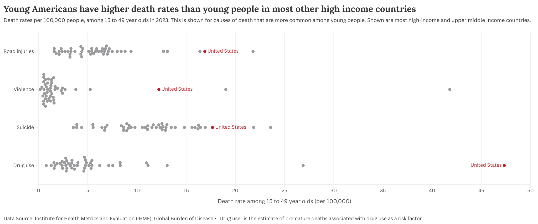
A big part of Americans’ lower life expectancy can be explained by the fact that they are much more likely to die from causes such as car crashes, violence, suicide, or drug overdoses. In the chart below, I’ve plotted death rates from these causes among 15- to 49-year-olds in 2023.4 Each dot represents a high- or upper-middle-income country.
The US is in red. There are a few other countries that have comparable or even higher rates. In this dataset, the few that do are Mexico and Costa Rica.
The gap between the US and most other countries is big. Death rates from drug use are almost 10 times higher. Road injuries, three times higher. Violence/homicide is more than five times higher.
Another thing to keep in mind is that estimates of infant mortality really impact life expectancy outcomes. One issue is that infant mortality rates are sensitive to what countries consider to be a “live birth”. This can vary. In some cases, an extremely premature baby that takes just one breath, then sadly passes, is counted as a live birth, and therefore included in mortality metrics. In others, they would not be counted at all.
I previously wrote about this question of how infant mortality is counted for Our World in Data, if you want to read more. I found that the US does have a definition of a live birth that is more stringent (in this case, harsher for the US’s final statistics) than many other countries.5 But even when we adjust for that (which I show in the article), its rates are still high compared to other high-income countries. So its infant mortality counts probably play some role in its low life expectancy at birth numbers, but this is not the key explanation.
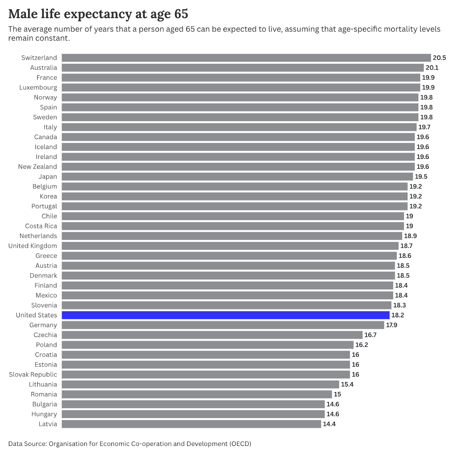
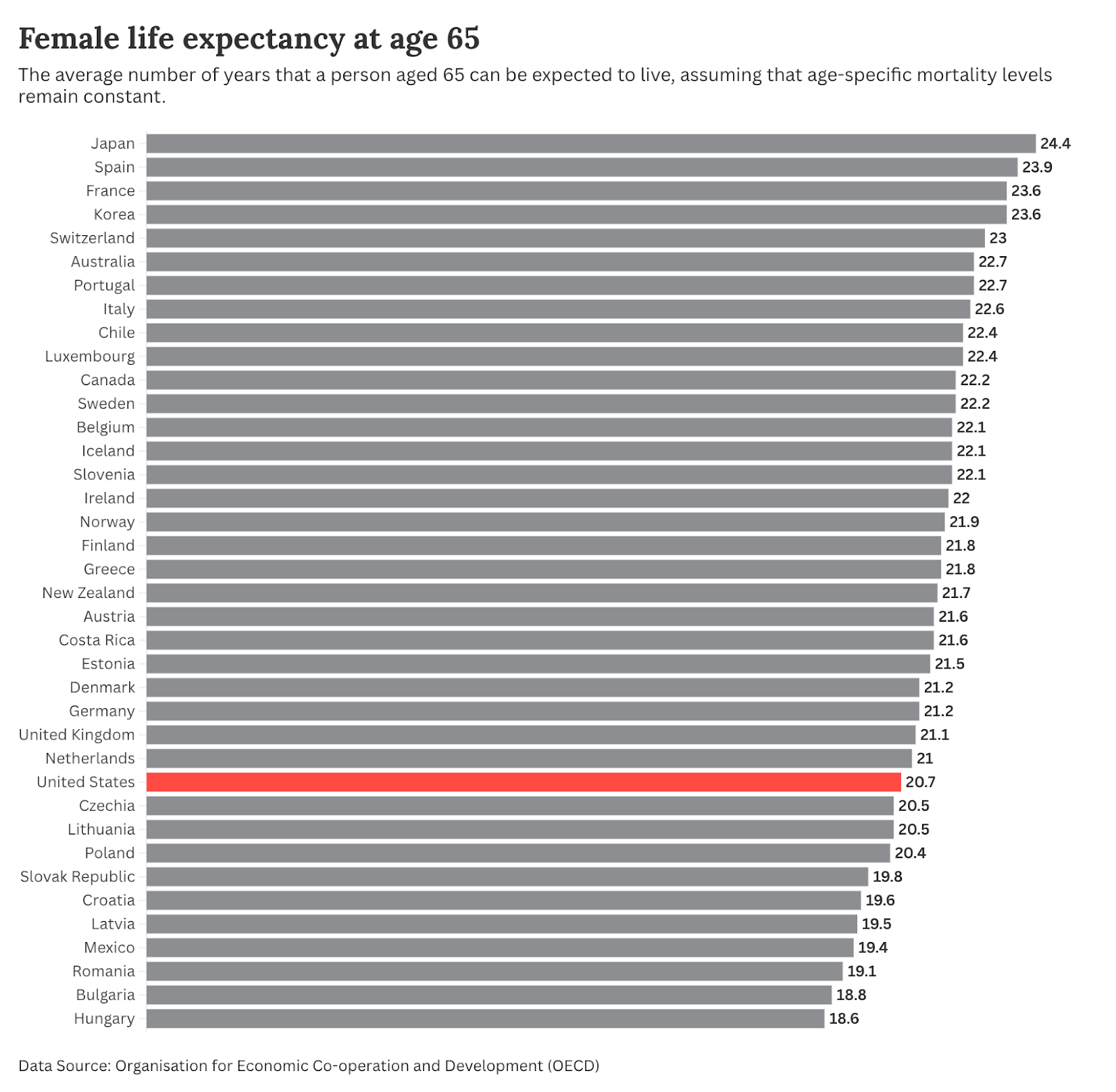
Life expectancy at age 65 is still not great for Americans
But what about those who make it to retirement age? Are they just as likely to live a long life as their other rich country peers?
The gap between countries at older ages is smaller. For men, the US remains firmly in the bottom half of the rankings, comparable to countries such as Germany, Finland, and Denmark. It’s two years behind leaders such as Switzerland, Australia, and France.
American women still lag quite far behind, though. The US is in the bottom third (granted, countries like the Netherlands, the UK, and Germany are too). It’s around 3 to 4 years behind leaders like Japan and Spain.
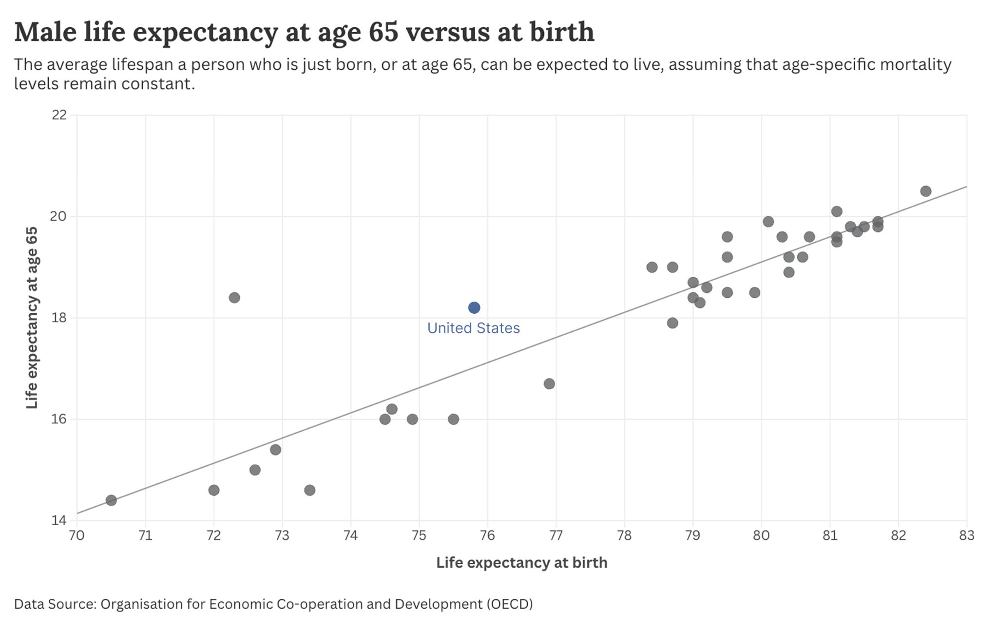
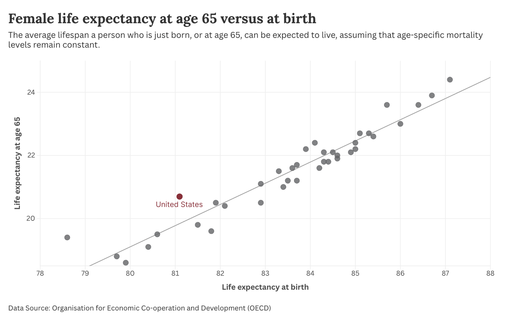
Another way to test whether it’s young deaths that make the US an outlier is to plot life expectancy at birth against life expectancy at age 65. I’ve done this first for men. Overall, we observe a strong correlation: countries with higher life expectancy at birth also have more years of life remaining at age 65.
For men, the US is somewhat of an outlier (hence why there’s a bit of distance between it and the trend line). But it’s not particularly dramatic.
The standout is Mexico. It has a particularly stark problem with very young deaths, which pulls down its life expectancy at birth figures relative to those for 65-year-olds.
For women, the US shows a fairly small deviation from the trend, with slightly higher expectancies at older ages for its life expectancy at birth figures.
Americans still spend a lot on healthcare for poor returns at older ages
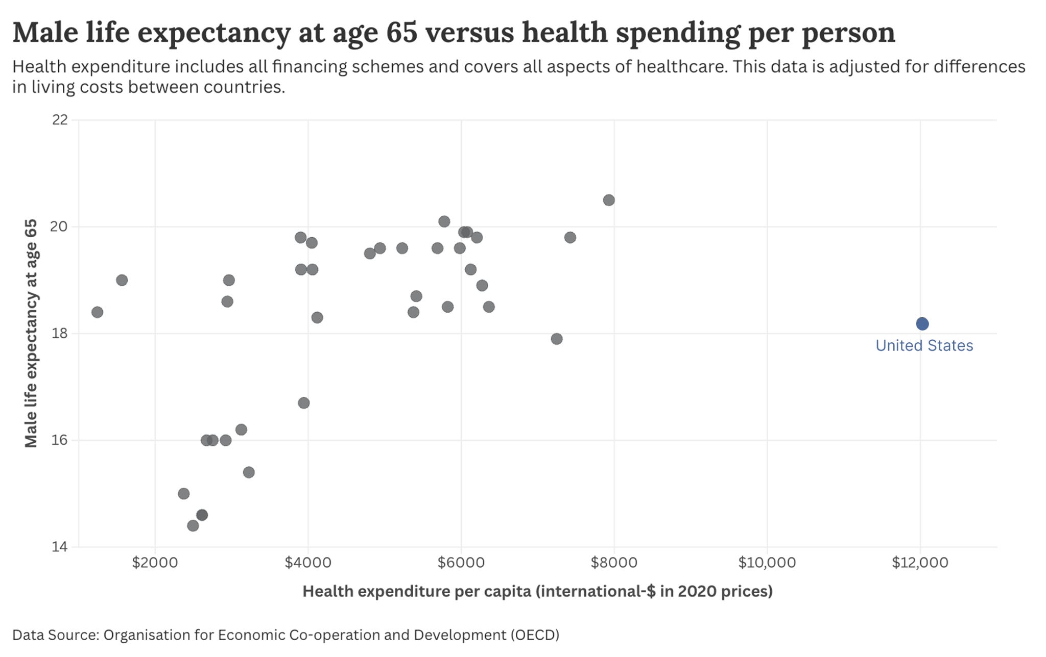
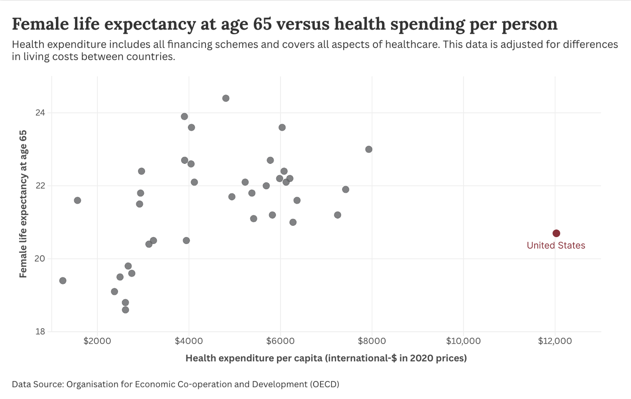
The point that Americans spend far more on healthcare without significant gains in health outcomes is again clear when we plot the first chart in this article, showing how much countries spend on healthcare, but replace life expectancy at birth with expectancy at 65 years. This data on healthcare spending is adjusted for differences in living costs across countries and covers all financing schemes (both public and private).
The US is still a clear outlier. Around $12,000 is spent per American per year. Most other rich countries spend around half that. Some even less.
Here’s that same plot, but with female life expectancy at age 65. There, the returns on investment look even worse.
To be clear: healthcare alone doesn’t determine longevity — social conditions, lifestyle, and prices matter too — but the US is still a clear outlier on spending relative to outcomes.
80-year-old Americans can expect to live as long as octogenarians from other rich countries
So far, I’ve taken 65 years as the definition of “older adults”. Or rather, used it as a threshold for removing younger deaths from the equation.
Some may argue that 65 is not old at all, and that healthcare spending matters most for those far older than this.
The OECD doesn’t have life expectancy data for age groups above 65, but the Human Mortality Database does have a metric for individuals at 80. I’ve plotted this for the selection of countries we previously looked at.
The differences across most countries are small. On this metric, the United States does fine. Not at the top of the pack, but higher in the rankings than it was for younger metrics. Americans aged 80 can expect to live as long as their peers in other wealthy countries. Granted, it’s more expensive to achieve the same outcome, and this convergence partly reflects selection: in countries with higher mortality earlier in life, those who reach 80 are likely to be a more robust group.

Early deaths are a major part of the story, but they don’t fully explain the US gap. Even among people who reach 65, Americans have fewer years left than their peers, meaning the US disadvantage persists into older adulthood. This is particularly true for women. The gap narrows by age 80, at least partly because of selection.
This is from an older article by my colleague, Max Roser: https://ourworldindata.org/us-life-expectancy-low
It has almost 50 countries in its sample. Not all of those countries had both life expectancy at birth and at age 65, so I’ve only used those that did (around 38 of them).
That means a handful of middle-income countries — including China, India, Brazil and South Africa — aren’t included. It also means that we’re doing an even closer comparison of the US to other high-income peers.
This selection effect exists in all countries: people who reach very old ages tend to be healthier than average. But it will be more pronounced in countries like the US that have higher death rates at younger ages, because more frail people die earlier. So comparisons at age 80 are likely to be more affected by selection in the US than in a country like Japan.
This data comes from the Institute for Health Metrics and Evaluation (IHME): https://vizhub.healthdata.org/gbd-results/
Many countries will set a gestational threshold, where any baby born earlier than, say, 22, 24 or 27 weeks is not considered to be a viable birth.
The US, on the other hand, usually counts all live births, regardless of gestational age.
Thanks for the great article!
There looks to me like a potentially meaningful typo in the section for LE at 65.
'To be clear: healthcare alone determines longevity — social conditions, lifestyle, and prices matter too'.
I'm guessing there should be a 'does not' in the first part of the sentence.
Is this explained by composition effects?
Mexican-Americans, Cuban-Americans and Japanese-Americans live longer than Mexicans, Cubans or Japanese citizens. European-Americans do slightly worse than Europeans, but the gap in life expectancy between North Europeans and Southern Europeans is a similar scale in both continents.
Scots-Irish people have a particular life expectancy problem but they make up a higher percentage of the population in American. West Virginia and Glasgow have much lower life expectancy and higher opiate use than equivalent areas in other regions.