
Does China have a huge electricity advantage over the United States?
China uses most of its electricity for industry, while the US consumes it in households and commercial services.

A few days ago, Elon Musk posted the following:
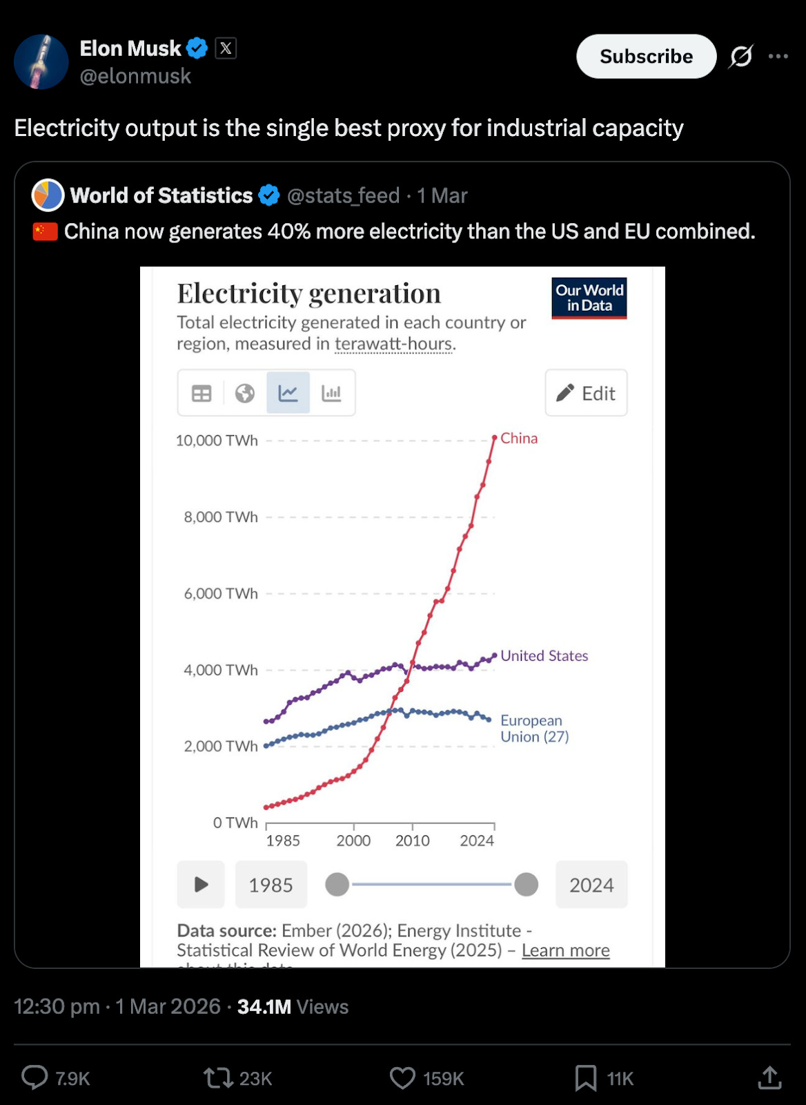
The chart is one that I know all too well: it comes from Our World in Data (based on data from Ember).
It’s not the first time I’ve seen people share a version of this chart, arguing that China’s huge growth in electricity generation means it should (or will) dominate global industrial output.
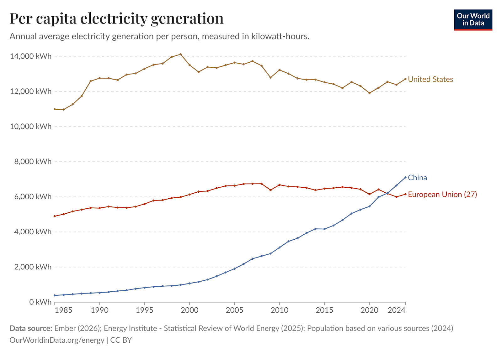
The replies are always the same: China has a much larger population, and when we adjust for that, the US generates far more. That’s certainly true. Here is the same comparison in per capita terms. China has overtaken the European Union in the last few years, but the US is still far ahead.
What’s also important here is the difference in the trend: electricity use in the US and EU has been flat for decades, while China is very much on a steep upward trajectory.
Now, we can argue whether it’s total or per capita generation that matters.
If it’s about the living standards of individuals, per capita makes more sense. A country could use a lot of electricity but still have most people living in energy poverty if it has a large population. If it’s about industrial capacity or dominance, total electricity is more revealing: your ability to dominate global solar panel or battery markets, robotics or other manufacturing sectors, is about how much stuff you can build and sell, not how much you can do per person.
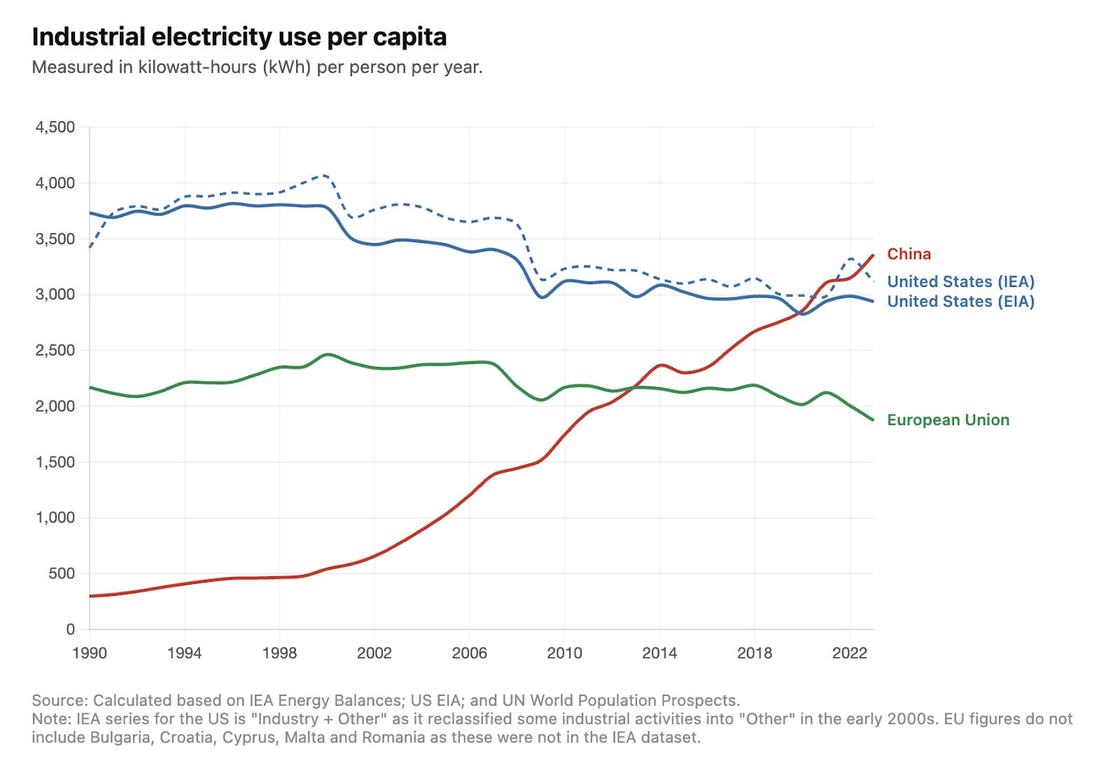
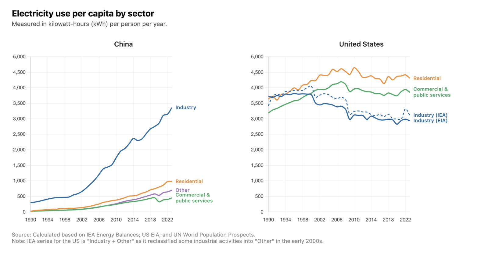
Nonetheless, let’s say these per capita comparisons do matter. America’s dominance is not as stark as these electricity-per-person figures first suggest. That’s because the US and China use electricity for very different things. The US uses most of its electricity in households and commercial services; China uses most of it for industry.
Here is the comparison of industrial electricity use per capita. The main source of this data is the International Energy Agency (IEA).1 You will notice that the US is shown twice: one line using the IEA data, and another using the US Energy Information Administration (EIA) for comparison. I’ll explain why I’ve done this in the footnote.2
Per person, China consumes slightly more industrial electricity than the US, and again, its trajectory looks very different. Both use more than the European Union.
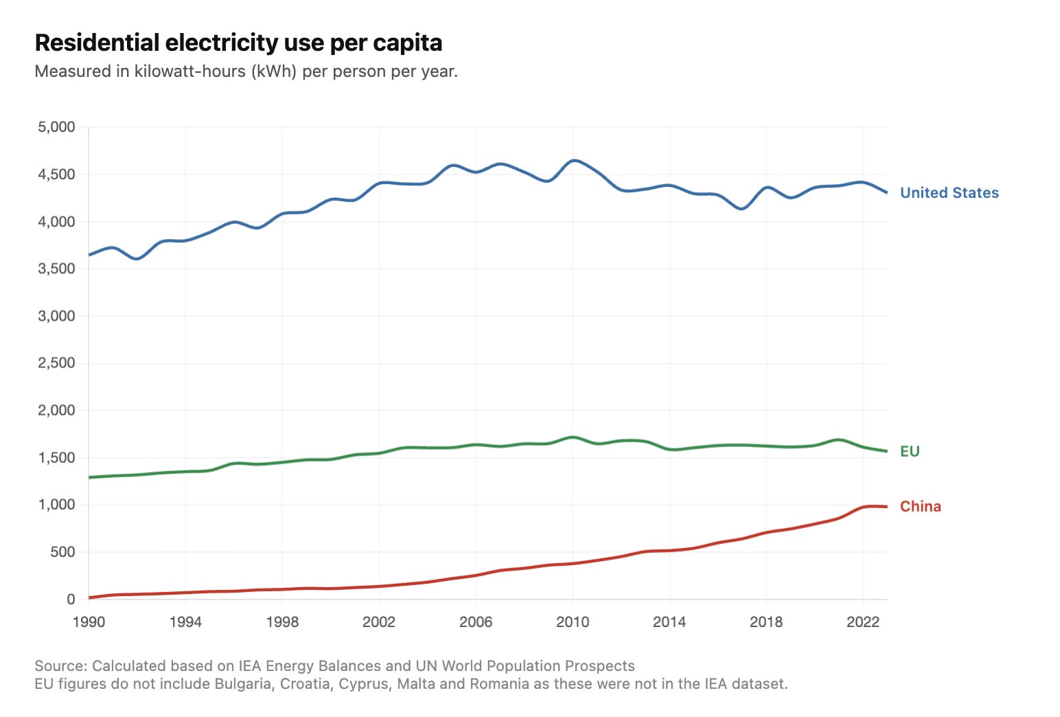
The big per capita gap between the US and China comes from the residential sector. Per person, Americans use more than four times as much as the Chinese at home.
The difference in electricity allocation is really stark when we look at all of these sectors together.3
China’s huge growth in electricity demand is really about industrial capacity.4 It not only uses far more than the US in absolute terms, but it also matches it on a per capita basis.
This story is hidden in the raw per capita comparisons that everyone shares as a rebuttal to Musk’s (and others’) argument at the top.
To get per capita values, I took this data by sector and divided by population from the UN World Population Prospects.
If you plot the raw IEA series for “Industry” for the US, there is a very large drop in electricity use in the early 2000s. While directionally correct, the magnitude of this drop seemed implausible to me.
After looking at the other sectoral data, this drop happens alongside a substantial rise in electricity use in the “Other end use” category. I think there is a reclassification of some industrial electricity in the US in the IEA dataset around this time, which leads to some odd results.
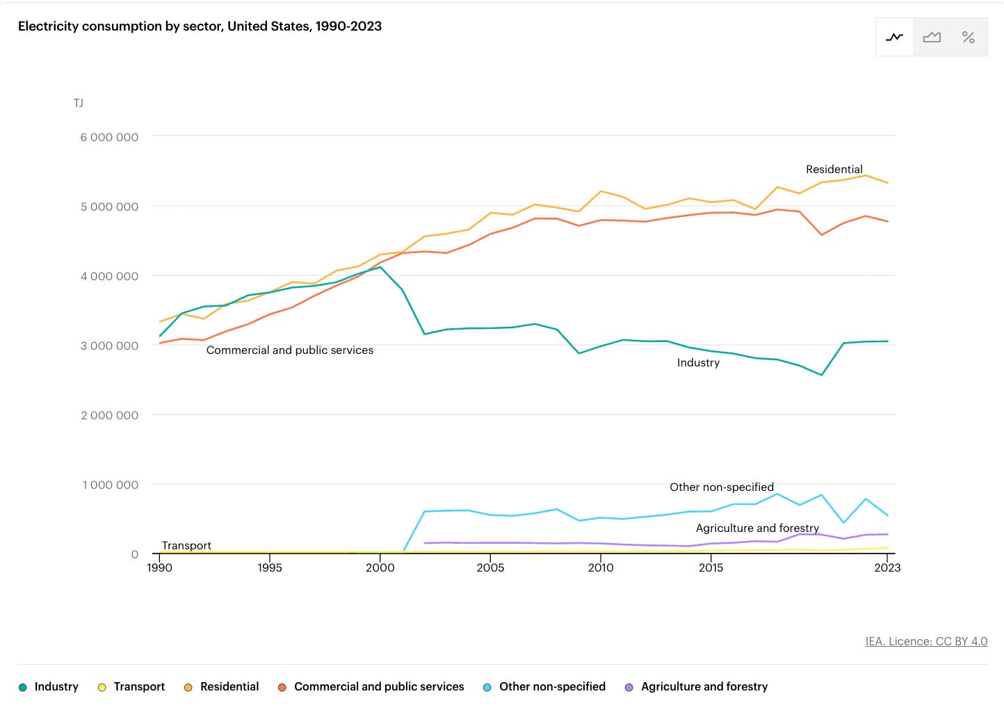
For the IEA series shown in the chart, I’ve therefore combined the “Industry” and “Other” category for the US. To check that this wasn’t unreasonable, I cross-compared it to the US EIA’s dataset, and it gives a decent (but not perfect) match.
My IEA series for the US might contain small amounts of electricity that are not industrial, but without more granular breakdowns, I couldn’t separate out the industrial from non-industrial use in the “Other” category. I still think that for the sake of this comparison, the estimates seem reasonable.
Here is the breakdown from the International Energy Agency:
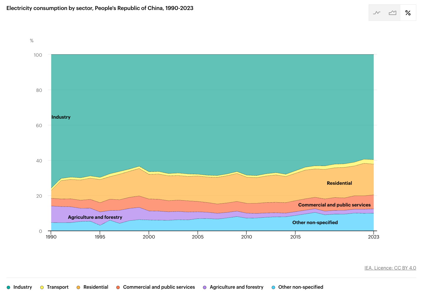
I did cross-check this data with national statistics from the Chinese Statistical Yearbook. It also shows that industry accounts for almost two-thirds of electricity consumption.
So Musk was more or less right in the point he was making, but chose the wrong chart to make the point
Does this data by sector, then, support the argument being made by many that the US can address a significant amount of new electricity demand for data centers, industry, and electrification by investing in residential energy efficiency?